
1: The Illusion of Perfection
If you are new to the world of Machine Learning, you likely have a very specific, and somewhat dangerous, goal in mind: Accuracy.
It is the metric we are all taught to chase. From our first days in school, we are conditioned to believe that $100%$ is the ultimate goal. You want your model to be “right.” You want it to look at a picture of a cat and say “Cat” $100%$ of the time. You want it to predict the stock market correctly every single day. You want to see that beautiful green bar on your dashboard hit $0.99$ or $1.0$.
When that happens, you feel a rush of dopamine. You think, “I’ve done it. I’ve solved the problem. I’ve built the perfect AI.”
Stop right there.
If you see $100%$ accuracy in your training phase, you haven’t built a perfect AI. In almost every real-world scenario, you have broken it. You have created a digital narcissist that loves its own reflection but cannot function in society.
This is the most painful, counter-intuitive lesson for every junior Data Scientist to learn: The goal of Machine Learning is not to memorize the past; it is to predict the future.
The Great Misunderstanding
To understand why “perfect” accuracy is a trap, we have to look at what we are actually asking a computer to do, and how it differs from traditional software engineering.
In traditional programming, we demand perfection. If you write a calculator app, 2 + 2 must equal 4 every single time. If it equals 4.00001 once, it is a bug. The logic is deterministic. The rules are hard-coded by a human.
In Machine Learning, we are dealing with probabilistic logic. We are dealing with the messy, noisy, chaotic real world. In the real world, relationships are rarely perfect.
- Does smoking cause cancer? Usually, but not always.
- Do larger houses cost more money? Generally, but a mansion in a bad neighborhood might be cheaper than a studio apartment in Manhattan.
- Is a photo of a dog always clearly a dog? Mostly, but what if it’s blurry? What if it’s a wolf?
If you force a machine to find a “perfect rule” that explains every single data point in history (e.g., every house price ever recorded), you force it to create rules that are so convoluted and specific that they no longer apply to reality.
This leads us to the two fundamental failures of AI: Overfitting and Underfitting. These are not just technical errors; they are failures of learning itself.
The Core Conflict: Memory vs. Intelligence
To understand these concepts deeply, we must strip away the math for a moment and ask: What does it actually mean to “learn”?
Imagine I hand you a massive history textbook covering the 20th Century and tell you there will be a critical exam tomorrow. You have two potential strategies to prepare:
Strategy A: The Camera (Pure Memory)
You possess a photographic memory. You spend the night scanning every single page. You memorize every sentence, every comma, every footnote, and every page number. You don’t “understand” what you are reading; you simply record the pixel data of the text into your brain.
- Your Knowledge: Exact. Precise.
- Your Flexibility: Zero.
Strategy B: The Concept (Pure Intelligence)
You read the book to understand the narrative. You learn about the causes of wars, the tension between economic systems, the rise of technology, and the shifts in culture. You might forget the exact date of a specific battle, or the middle name of a general, but you understand why things happened.
- Your Knowledge: Fuzzy. Approximate.
- Your Flexibility: High.
The Test: Where Models Die
Now, let’s administer the exam. This is where the difference between Training Accuracy and Test Accuracy becomes fatal.
Scenario 1: The Recall Test (Training Data) If the exam asks, “What is the third word on page 42?”, the student using Strategy A (The Camera) wins instantly. They answer correctly with $100%$ confidence. The student using Strategy B fails; they didn’t memorize page numbers.
Scenario 2: The Generalization Test (Test Data) If the exam asks, “Based on the economic patterns of the 1920s described in the book, how might a similar supply chain shock affect the modern crypto market?”
Strategy A collapses. They search their memory for “crypto market” and find nothing. Because the book didn’t mention it, they have no answer. They cannot extrapolate. They cannot think. They can only repeat.
Strategy B succeeds. They take the patterns they learned (supply vs. demand, inflation psychology) and apply them to this new, unseen situation.
The Definition of Generalization
This brings us to the holy grail of our field.
In Machine Learning, Generalization is the ability of a model to perform well on data it has never seen before.
- Underfitting is when the model is too lazy to learn the rules (It didn’t read the book at all).
- Overfitting is when the model is too obsessed with the data (It memorized the book verbatim).
Both of these result in a model that fails in production. The entire discipline of Machine Learning Engineering—from Regularization to Cross-Validation—is effectively a war against these two enemies, trying to find the thin strip of land in the middle called “The Good Fit.”
2: The Analogy — The Three Students
Before we look at a single line of Python code, a polynomial equation, or a gradient descent graph, we need to intuitively grasp the behavior of these models. The best way to do this is to return to a place we all know well: the classroom.
To understand Machine Learning performance, imagine a specific scenario. We have a difficult math exam coming up. There are three students in the class: Alice, Bob, and Charlie.
They all have access to the same study material: a Practice Textbook (This is our Training Data) which contains 100 specific questions and their correct answers.
The next day, they must take the Final Exam (This is our Test Data). The Final Exam covers the exact same topics as the practice book (e.g., calculus, algebra), but the specific numbers and wording of the questions are completely new. They have never seen these specific problems before.
Let’s analyze how each student prepares and, consequently, how they fail or succeed.
1. Student A: The Slacker (Underfitting)
The Behavior: Alice is lazy. She opens the Practice Textbook, glances at the first page, and feels overwhelmed. Instead of trying to learn the complex rules of calculus, she decides to rely on simple, broad assumptions.
She looks at a few multiple-choice questions and thinks, “You know what? ‘C’ seems to be the answer most of the time. I’ll just guess ‘C’ for everything.” Or perhaps she decides, “Math is just adding numbers. If I see two numbers, I will add them.”
The Training Phase: When she takes the practice quiz at home, she does terribly. She scores a 25%. She gets almost every question wrong because her model of the world (“Everything is C”) is too simple to match the reality of the test.
The Exam Phase: On the Final Exam, she also scores 25%. Her strategy is consistently bad.
The ML Diagnosis: Underfitting (High Bias) Alice represents a model that Underfits.
- High Bias: She has a strong, pre-conceived notion (bias) about the data that ignores the evidence. She assumes the relationship is simple (linear) when it is actually complex (curved).
- The Problem: The model is not complex enough to capture the underlying structure of the data. It fails to learn the signal.
2. Student B: The Memorizer (Overfitting)
The Behavior: Bob is the opposite of Alice. Bob is terrified of failing. He wants a perfect score. He possesses a photographic memory and immense dedication, but he lacks an understanding of logic.
Bob spends 100 hours studying the Practice Textbook. But he doesn’t learn the formulas. He memorizes the mapping between questions and answers.
- He learns: “If the question starts with ‘A train leaves Chicago at 4 PM’, the answer is 65 miles per hour.”
- He learns: “If the triangle has a side of length 5, the area is 12.5.”
He essentially builds a massive mental lookup table. He treats every specific detail in the practice questions as a “Rule of the Universe,” even the irrelevant details (like the city name “Chicago”).
The Training Phase: On the practice quiz at home, Bob is a legend. He scores 100%. He gets every single question right because he has seen them all before. To an outside observer (or a naive Data Scientist), Bob looks like the perfect student.
The Exam Phase: The Final Exam begins. Question 1 reads: “A train leaves Boston at 4 PM…” Bob panics. His internal rule says the train must leave Chicago. He has no rule for Boston. He writes down “65 mph” anyway, because that’s what he memorized. The answer is wrong. Bob scores a 40% on the final exam. The gap between his practice score (100%) and his exam score (40%) is massive.
The ML Diagnosis: Overfitting (High Variance) Bob represents a model that Overfits.
- High Variance: His performance varies wildly depending on the dataset. Change the input slightly (Chicago to Boston), and his output collapses.
- The Problem: The model is too complex. It has learned the Noise (the city names, the specific phrasing) rather than the Signal (the formula $Distance = Rate \times Time$).
3. Student C: The Scholar (The Good Fit)
The Behavior: Charlie studies the Practice Textbook with a different goal. He looks for patterns. He notices, “Hey, every time they ask for the area of a triangle, they multiply the base by the height and divide by two. I don’t need to memorize the specific numbers; I just need to remember that rule.”
The Training Phase: On the practice quiz, Charlie gets a 92%. He isn’t perfect. Maybe he makes a small calculation error here or there. He is actually worse than Bob (The Memorizer) during practice.
The Exam Phase: On the Final Exam, Charlie sees the “Train leaving Boston” question. He has never seen this specific question before. But he knows the formula for rate and distance. He applies the formula to the new numbers and gets the answer right. He scores a 90% on the Final Exam.
The ML Diagnosis: Generalization Charlie represents the ideal model.
- Robustness: His performance on the Training Data (92%) is very close to his performance on the Test Data (90%).
- The Goal: He ignored the noise (Chicago vs. Boston) and captured the signal (the math formulas).
The Takeaway Table
This analogy provides us with a rubric for evaluating our own models. When you look at your loss curves, ask yourself: “Which student is my model behaving like?”
| Student | ML Concept | Training Score | Test Score | The Problem |
|---|---|---|---|---|
| Alice | Underfitting | Low (Bad) | Low (Bad) | Too Simple. Didn’t learn the patterns. |
| Bob | Overfitting | High (Perfect) | Low (Bad) | Too Complex. Memorized the noise. |
| Charlie | Good Fit | High (Good) | High (Good) | Just Right. Learned the patterns. |
To truly understand model performance, we need to visualize it. This is where the concept of “Model Complexity” becomes visible to the naked eye.
The Setup: Signal and Noise
Imagine we are plotting data on a simple 2D graph.
- X-axis: The size of a house.
- Y-axis: The price of the house.
In a perfect world, this relationship might be a smooth, upward curve. But the real world is messy. Some small houses are expensive (Signal + Noise). Some big houses are cheap (Signal - Noise).
When we plot this data, we don’t get a line; we get a cloud of dots. The job of Machine Learning is to draw a line through this cloud that best predicts the future.
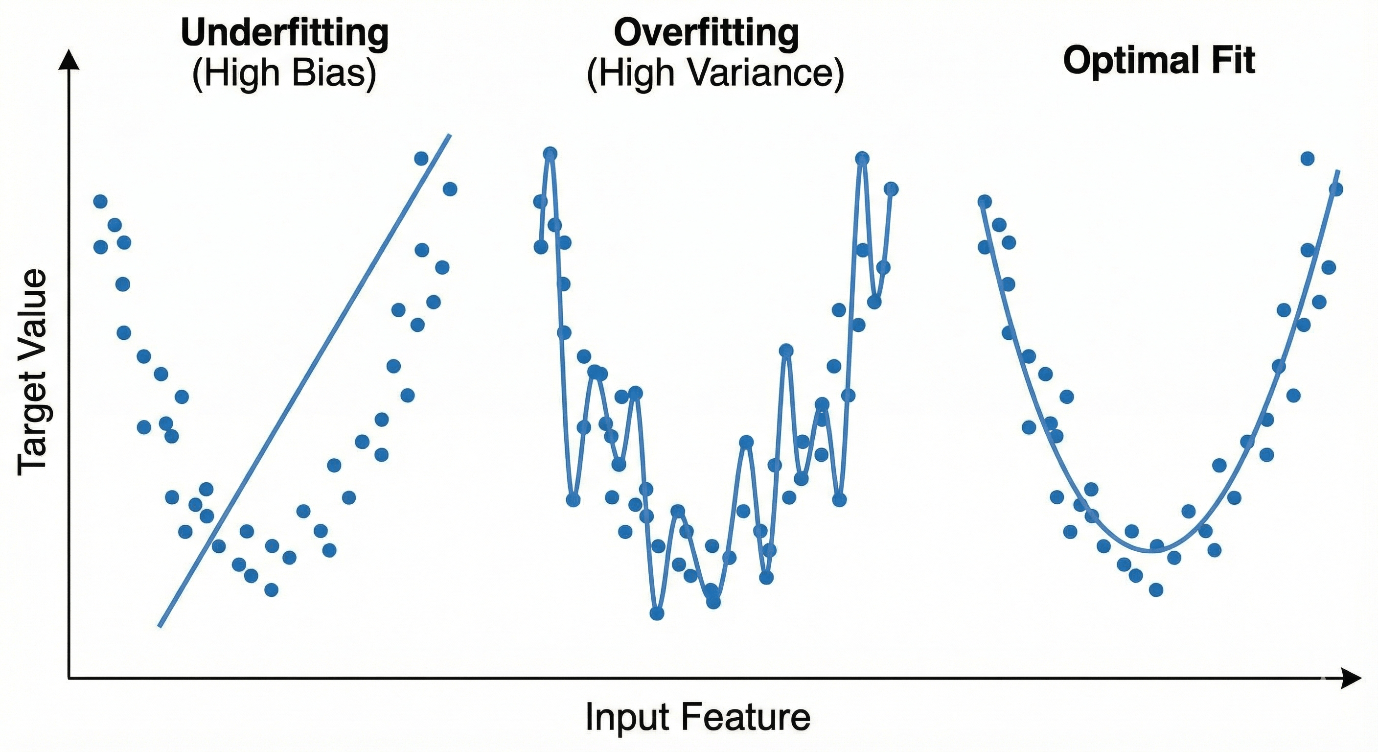 Figure: Underfitting, Overfitting, and an optimal fit visualized on a scatter plot.
1. Visualizing Underfitting (The Rigid Rod)
Imagine trying to fit a straight steel rod through a curved cloud of points.
If the data follows a “U” shape or a complex curve, and you force a straight line through it, you will miss most of the points. The line is physically incapable of bending to match the reality of the data.
- Geometric Trait: Linearity (Straightness).
- The Failure: The line cuts through the middle, but it ignores the curvature. It predicts that prices will keep going up linearly, even if the data shows they are leveling off.
- Why it happens: The model is “too rigid.” In mathematical terms, it has insufficient degrees of freedom. It is like trying to sculpt a statue using only rectangular bricks; you cannot capture the curves of a face.
This is the geometric definition of High Bias. The model is “biased” towards being straight, regardless of what the dots are telling it.
2. Visualizing Overfitting (The Vibrating Wire)
Now, imagine the opposite. Instead of a steel rod, we give the model a piece of wet string. We tell the model: “You must touch every single dot.”
The string goes up to touch a high dot, then violently swings down to touch a low dot, then shoots back up again. If you look at the resulting shape, it doesn’t look like a trend. It looks like the seismograph of an earthquake.
- Geometric Trait: Extreme Curvature (High Volatility).
- The Failure: While the line touches every dot perfectly (Low Error), the space between the dots is a disaster.
- If you ask for a prediction at a point where you have data, it is perfect.
- If you ask for a prediction between two data points, the line might be wildly off because it is in the middle of a violent swing to reach the next outlier.
- Why it happens: The model has too many degrees of freedom. It is bending to fit the Noise (the random jitter of the dots) rather than the Signal (the general direction).
This is the geometric definition of High Variance. If you moved just one data point slightly, the entire shape of the squiggly line would change dramatically.
3. Visualizing The Good Fit (The Smooth Curve)
The ideal model is a flexible wooden slat. It can bend to capture the general “U” shape or “S” shape of the data, but it resists sharp, jagged turns.
It passes through the cloud of dots, not touching all of them, but staying in the center of the density.
- It ignores the one weirdly expensive small house (Outlier).
- It captures the fact that prices level off for very large houses (Trend).
The Mathematical Translation: Polynomial Degrees
We can express this geometry using simple algebra (Polynomial Regression):
- Underfitting (Degree 1): $y = mx + b$
- A straight line. Too simple.
- Good Fit (Degree 2 or 3): $y = ax^2 + bx + c$
- A curve (Parabola). Just right.
- Overfitting (Degree 15): $y = ax^{15} + bx^{14} + …$
- A monster. The equation creates a line that wiggles 14 times.
The Takeaway
When you visualize Overfitting, don’t just think “it memorized the data.” Think about the empty space between the data points.
An overfitting model creates a landscape of “peaks and valleys” that don’t exist in reality. It hallucinates patterns in the empty space because it is trying too hard to connect the dots of the past.
4: Diagnosing the Patient — Learning Curves
In a hospital, a doctor doesn’t cut you open to see if you have a fever; they look at a thermometer.
In Machine Learning, we don’t visualize high-dimensional geometry (because we can’t visualize 100 dimensions). Instead, we look at Learning Curves.
These curves plot your model’s Error (Loss) over time (Epochs). If you know how to read them, they tell you exactly which disease your model has.
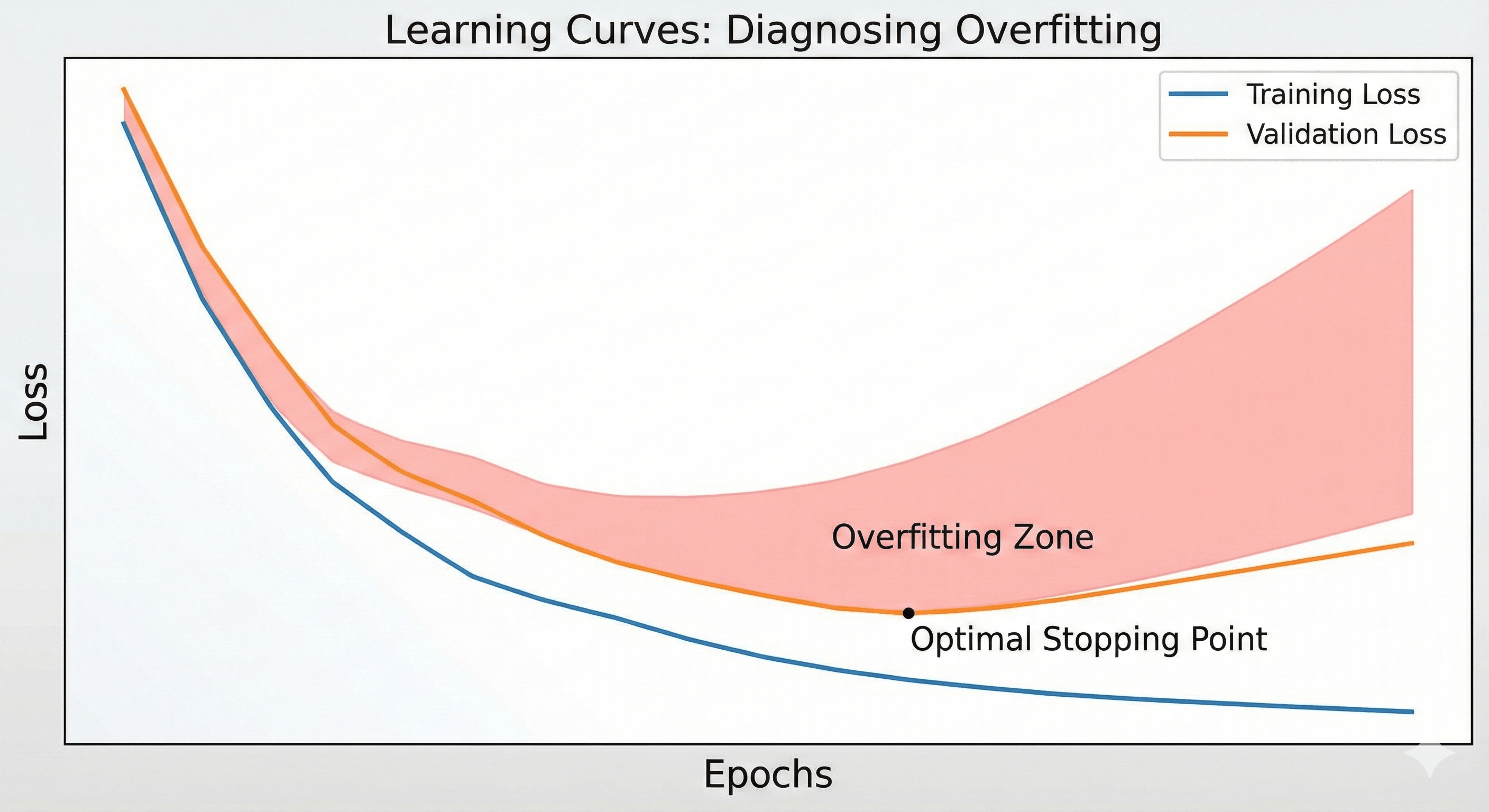 Figure: Training vs validation loss demonstrating divergence during overfitting.
The Two Vitals
To diagnose a model, you need two distinct lines on your chart:
- Training Loss (Blue Line): How well the model is doing on the “Practice Textbook.”
- Validation Loss (Orange Line): How well the model is doing on the “Mock Exam” (Data it has never seen).
Diagnosis 1: Underfitting (The Flatline)
The Chart:
- Training Loss: High (and stays high).
- Validation Loss: High (and stays high).
- The Shape: Two flat lines hovering near the top of the graph.
The Interpretation: The model isn’t learning anything. It started stupid and stayed stupid. The gap between the lines might be small, but the error itself is unacceptable.
- Analogy: The student gets 40% on the practice test and 40% on the final exam. They are consistently bad.
- Action: You need a more complex model (add layers, increase parameters) or better features.
Diagnosis 2: Overfitting (The Divergence)
The Chart:
- Training Loss: Goes down, down, down (Approaching Zero).
- Validation Loss: Goes down for a bit, then flattens out, and then starts going back up.
- The Shape: A massive “jaw” opening up. The lines diverge.
The Interpretation: This is the classic “Gap of Death.” As the Blue line (Training) keeps dropping, the model is memorizing the noise. As the Orange line (Validation) starts rising, the model is getting worse at generalizing. It is becoming so specialized to the training data that it is losing its ability to function in the real world.
- Analogy: The student scores 100% on the practice test, but their score on the final exam drops from 80% to 60% because they are overthinking simple questions based on memorized rules.
- Action: Stop training immediately (Early Stopping), get more data, or use Regularization.
Diagnosis 3: The Good Fit (The Convergence)
The Chart:
- Training Loss: Low.
- Validation Loss: Low.
- The Shape: Both lines slope downwards and plateau near the bottom. There is a small gap (Training is always slightly better), but the lines are stable and parallel.
The Interpretation: The model has learned the patterns. It performs almost as well on new data as it does on the data it studied.
The Golden Rule of Diagnostics
We do not care about Training Loss.
Let me repeat that: We do not care about Training Loss.
You can always drive Training Loss to zero if you make the model big enough. It is a vanity metric. The only line that matters for your business, your users, and your career is the Validation Loss.
If Validation Loss is not improving, your model is not improving—no matter what the Training Loss says.
5: The Mathematical Trap — The Bias-Variance Tradeoff
We have talked about “Students,” “Curves,” and “Geometry.” Now, we must talk about the Theory.
In Statistics and Machine Learning, there is a fundamental theorem known as the Bias-Variance Tradeoff. It states that it is mathematically impossible to simultaneously minimize two specific sources of error without compromise. You essentially have to “pay” for lower bias with higher variance, and vice versa.
To understand this, we break down “Error” into three distinct components:
$$\text{Total Error} = \text{Bias}^2 + \text{Variance} + \text{Irreducible Error}$$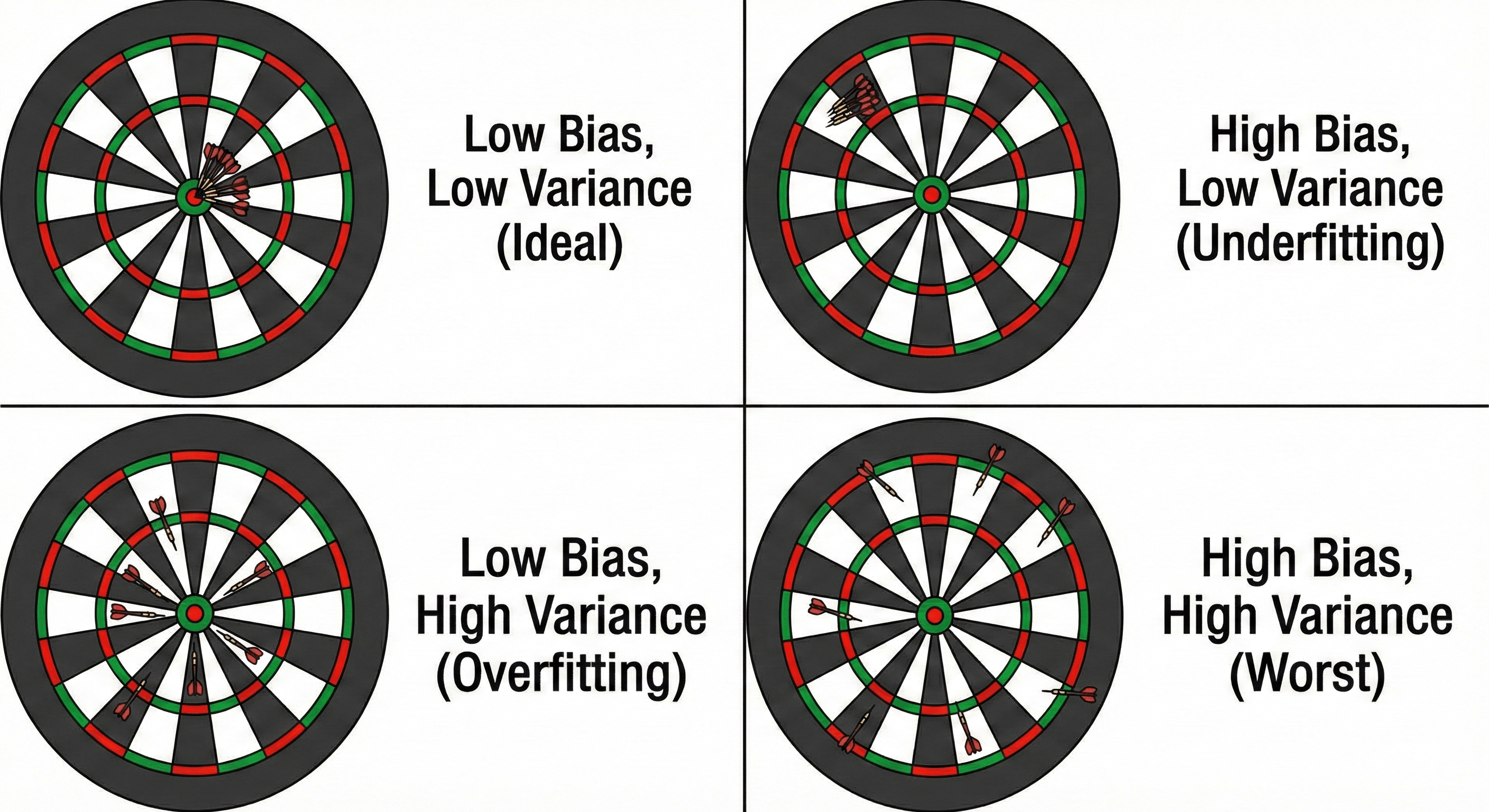 Figure: Dartboard analogy showing combinations of low/high bias and variance.
Let’s dissect exactly what these mean.
1. Bias (The Error of Assumptions)
Bias is the error introduced by approximating a real-world problem (which may be extremely complicated) with a simplified model.
- High Bias means your model is making strong, incorrect assumptions about the data.
- The Symptom: It pays very little attention to the training data and oversimplifies the model.
- The Result: Underfitting.
- In English: “I don’t care what the data says; I assume the world is a straight line.”
2. Variance (The Error of Sensitivity)
Variance is the error introduced by the model’s sensitivity to small fluctuations in the training set.
- High Variance means your model pays too much attention to the specific data it was trained on. If you split your dataset into two halves and trained a model on each half, a High Variance model would give you two completely different results.
- The Symptom: It captures random noise as if it were a significant pattern.
- The Result: Overfitting.
- In English: “I saw one specific example, and I am going to build a massive, complex rule based entirely on that one coincidence.”
3. Irreducible Error (The Noise)
This is the error that you can never remove. It is the noise inherent in the system itself.
- Maybe the sensor reading the temperature was faulty.
- Maybe the house sold for a cheap price because the owner was in debt (a factor not in your dataset).
No matter how good your model is, you cannot predict this. It is the “Ghost in the Machine.”
The Bullseye Visualization
The standard way to visualize this is using a Dartboard. Imagine the center of the bullseye is the “True Reality” (the perfect prediction). You throw a handful of darts (predictions).
- Low Bias, Low Variance (The Dream): All darts hit the bullseye. They are accurate (on target) and precise (grouped together).
- High Bias, Low Variance (Underfitting): All darts are tightly grouped, but they are all in the top-left corner, far from the center. You are consistently wrong.
- Low Bias, High Variance (Overfitting): The darts are scattered all over the board. If you averaged their positions, you might get the center, but any single dart is wildly unpredictable.
- High Bias, High Variance (Disaster): The darts are scattered everywhere, and they aren’t even centered on the target.
The “Tradeoff”
Here is the tragedy of Machine Learning: Complexity is a dial.
- Turn the dial down (Simplify): You reduce Variance (the model becomes more stable), but you increase Bias (the model becomes too rigid).
- Turn the dial up (Complicate): You reduce Bias (the model becomes flexible enough to fit the data), but you increase Variance (the model starts chasing noise).
There is no “perfect” setting. There is only a “Tradeoff.” Your job as an engineer is to tune this dial until the Total Error is at its mathematical minimum.
6: The First Line of Defense — Cross-Validation
In 4, we talked about splitting your data into “Training” and “Validation” sets. Usually, beginners do this by taking the first 80% of rows for training and the last 20% for testing.
This is dangerous.
Why? Because of Luck.
Imagine your dataset is a list of house prices.
- Scenario A (Good Luck): By random chance, your Test Set contains all the “average” houses. Your model predicts them easily. You get a 99% accuracy score. You high-five your boss.
- Scenario B (Bad Luck): By random chance, your Test Set contains all the weird mansions and tiny shacks (the outliers). Your model fails miserably. You get a 60% accuracy score. You panic.
In both scenarios, the model is the same. The only difference is which data points ended up in the “Test” bucket. You cannot trust a single score.
The Solution: K-Fold Cross-Validation
To eliminate luck, we use a technique called K-Fold Cross-Validation. Instead of testing the student once, we test them multiple times on different topics.
The Process:
- Shuffle the dataset randomly.
- Split it into $K$ equal groups (called “Folds”). Let’s say $K=5$.
- Round 1: Hold out Fold 1 as the Test Set. Train on Folds 2-5. Measure Score.
- Round 2: Hold out Fold 2 as the Test Set. Train on Folds 1, 3, 4, 5. Measure Score.
- Repeat until every Fold has been used as the Test Set exactly once.
- Average the scores.
Why This Works
This technique ensures that every single data point gets a chance to be in the “Test Set.” If there are weird outliers, they will eventually be tested on.
The final score you get is not just a single number; it is a statistical average with a standard deviation.
- Instead of saying “My accuracy is 90%.”
- You say “My accuracy is 90% $\pm$ 2%.”
This is scientifically robust. It tells you how stable your model is.
The Code: Doing it in Scikit-Learn
Implementing this in Python is incredibly simple. You don’t need to write for loops yourself; sklearn handles the heavy lifting.
from sklearn.model_selection import cross_val_score
from sklearn.linear_model import LinearRegression
from sklearn.datasets import make_regression

# 1. Create Dummy Data
X, y = make_regression(n_samples=100, n_features=1, noise=20, random_state=42)

# 2. Initialize Model
model = LinearRegression()

# 3. Run 5-Fold Cross-Validation
# cv=5 means "Split into 5 parts"
scores = cross_val_score(model, X, y, cv=5, scoring='r2')

# 4. Print Results
print(f"Individual Scores: {scores}")
# Output: [0.85, 0.92, 0.78, 0.88, 0.91] -> Notice the variance!

print(f"Average Score: {scores.mean():.2f}")
# Output: 0.87


Interpreting the Result
Look at the output above. In one lucky fold, the model scored 0.92. In an unlucky fold, it scored 0.78.

If you had just done a single Train/Test split, you might have seen 0.92 and thought you were a genius, or 0.78 and thought you were a failure. Cross-Validation reveals the True Performance (0.87).

Now that we know how to measure the problem correctly, we are ready to start fixing it. In the next part, we will look at the first cure for Overfitting: Regularization.
7: The Magic Pill — Regularization (L1 & L2)
If your model is Overfitting, it means it is “trying too hard.” It is contorting itself into wild shapes to fit every single data point.
How do we stop this? We could just delete half our data, but that’s wasteful. A better approach is to change the rules of the game.
We tell the model: “I want you to fit the data, BUT I will punish you if you use complex equations to do it.” This technique is called Regularization.
The Math: Changing the Loss Function
Normally, a model tries to minimize Error (Residual Sum of Squares). $$\text{Minimize}(\text{Error})$$
In Regularization, we change the goal. We add a Penalty term. $$\text{Minimize}(\text{Error} + \text{Penalty})$$
The “Penalty” is based on the size of the coefficients (weights) the model uses. If the model tries to use a massive weight (e.g., $1000 \times x^3$) to fit a weird outlier, the Penalty becomes huge, and the total score gets worse. The model is forced to choose smaller, simpler weights to win.
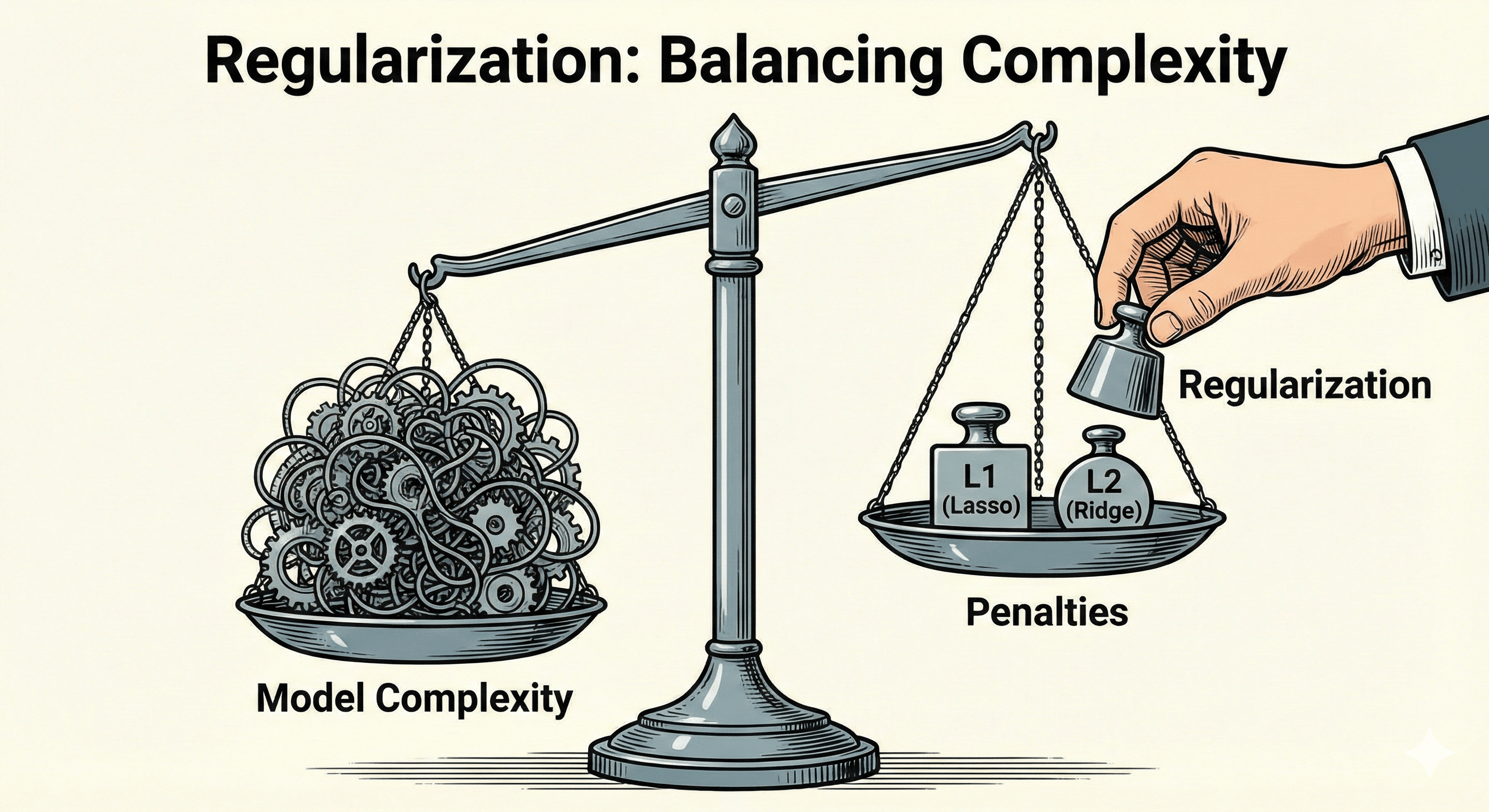 Figure: A balance scale metaphor showing how L1 and L2 penalties discourage complexity.
The Two Flavors: L1 vs. L2
There are two main ways to calculate this penalty.
1. L1 Regularization (Lasso)
“The Butcher”
- The Math: We add the Absolute Value of the weights. $$\lambda \sum |w|$$
- The Behavior: L1 is aggressive. It tends to force weak features to become exactly Zero.
- The Use Case: Feature Selection. If you have a dataset with 1,000 columns but you suspect only 10 are useful, use Lasso. It will automatically delete the 990 useless columns (set their weights to 0).
2. L2 Regularization (Ridge)
“The Surgeon”
- The Math: We add the Squared Value of the weights. $$\lambda \sum w^2$$
- The Behavior: L2 is gentler. It forces weights to become very small (near zero), but rarely exactly zero. It spreads the influence across many features.
- The Use Case: Collinearity. When you want to keep all your features but make sure none of them dominate the model excessively. This is the default choice for most regression problems.
The Code: Ridge and Lasso in Python
Using these in scikit-learn is as easy as swapping LinearRegression for Ridge or Lasso.
The strength of the penalty is controlled by a parameter usually called alpha (or lambda in math books).
- High Alpha: Strong penalty -> Simple Model (Risk of Underfitting).
- Low Alpha: Weak penalty -> Complex Model (Risk of Overfitting).
from sklearn.linear_model import Ridge, Lasso, LinearRegression
from sklearn.model_selection import train_test_split
from sklearn.datasets import make_regression

# Generate Data
X, y = make_regression(n_samples=100, n_features=50, noise=10, random_state=42)
X_train, X_test, y_train, y_test = train_test_split(X, y, test_size=0.2)

# 1. Standard Linear Regression (No Penalty)
model_simple = LinearRegression()
model_simple.fit(X_train, y_train)
print(f"Simple Score: {model_simple.score(X_test, y_test):.4f}")
# Result: Might overfit if data is noisy.

# 2. Ridge Regression (L2 Penalty)
# alpha=1.0 is the default. Increase it to punish more.
model_ridge = Ridge(alpha=10.0)
model_ridge.fit(X_train, y_train)
print(f"Ridge Score:  {model_ridge.score(X_test, y_test):.4f}")
# Result: Usually better generalization on unseen data.

# 3. Lasso Regression (L1 Penalty)
model_lasso = Lasso(alpha=0.1)
model_lasso.fit(X_train, y_train)
print(f"Lasso Score:  {model_lasso.score(X_test, y_test):.4f}")
print(f"Features used: {sum(model_lasso.coef_ != 0)}")
# Result: Tells you exactly how many features it kept!
8: The Curse of Dimensionality
There is a common misconception in Data Science: “The more data, the better.”
This is true if you mean more Rows (examples). This is often FALSE if you mean more Columns (features).
Imagine you are trying to predict house prices. You start with SquareFootage and NumBedrooms. The model works okay.
Then you add ZipCode. It gets better.
Then you add PaintColor, DoorHandleMaterial, NameOfPreviousOwner, SoilPHLevel, and DistanceToNearestTacoBell.
Suddenly, your model crashes. Its accuracy tanks. You have just fallen victim to The Curse of Dimensionality.
The Geometric Intuition
To understand why this happens, we have to think about “Space.”
- 1D Space (A Line): Imagine you have 10 data points on a 10-meter line. The points are crowded. It’s easy to see the pattern.
- 2D Space (A Square): Now, spread those 10 points across a $10 \times 10$ meter room. They are much further apart.
- 3D Space (A Cube): Spread them in a $10 \times 10 \times 10$ room. The room is mostly empty air.
As you add dimensions (features), the “Volume” of the space grows exponentially.
- A 1D line has size $x$.
- A 100D hypercube has size $x^{100}$.
Unless you increase your number of Training Examples (Rows) exponentially to keep up, your data becomes incredibly Sparse.
Why This Causes Overfitting
When data is sparse (far apart), it becomes trivially easy to separate.
Imagine a room with just two people in it: one Red, one Blue. You can draw a wall between them anywhere you want. You can separate them perfectly with a million different walls.
But just because you separated them doesn’t mean you found a “pattern.” You just found a lucky wall in an empty room.
- In Low Dimensions: The data is dense. The model is forced to find the true trend to fit the points.
- In High Dimensions: The data is lonely. The model can easily draw a wiggly 100-dimensional hyperplane that touches every point perfectly without learning anything. This is Overfitting.
The Rule of Thumb
A common rule of thumb in statistics is that for every feature (column) you add, you need exponentially more examples (rows) to maintain the same statistical significance.
If you have 100 rows of data and 500 columns of features, your model is mathematically doomed to overfit.
The Solution: Dimensionality Reduction
If you find yourself with too many features, you have two options:
- Feature Selection: Use your brain. Does
DoorHandleMaterialreally matter? If not, delete the column. - Dimensionality Reduction (PCA): Use math. Techniques like Principal Component Analysis (PCA) can squash those 500 dimensions down to the 3 most important “Principal Components” that capture 95% of the variance.
9: Taming the Beast — Dropout & Early Stopping
Deep Neural Networks are the ultimate “Memorizers.” They are so flexible and have so many parameters (millions or billions) that they can memorize any dataset you throw at them. This makes them prone to massive Overfitting.
To fix this, we use two techniques that might seem counter-intuitive: quitting early and brain damage.
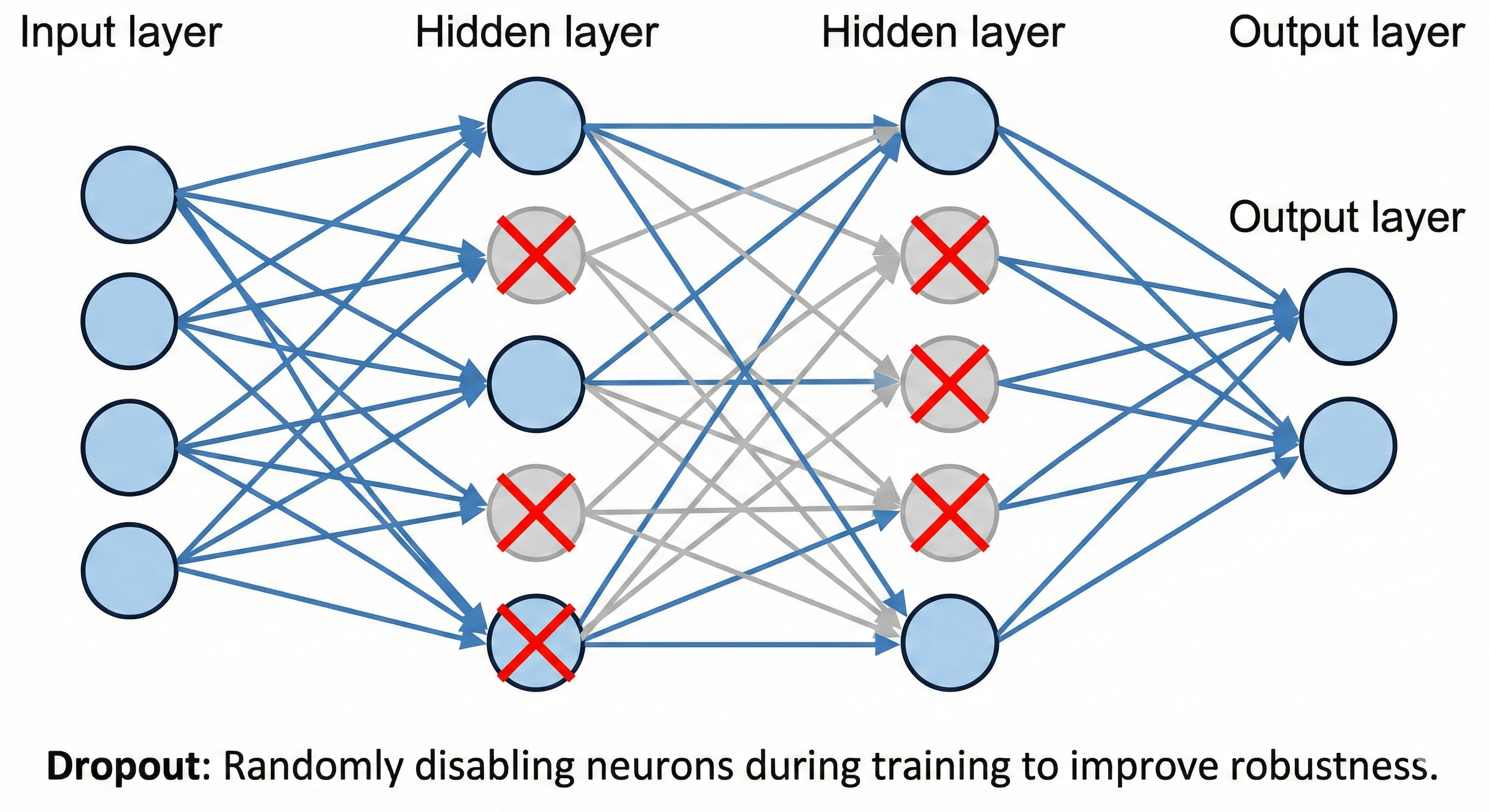 Figure: Neural network with randomly disabled neurons illustrating Dropout.
1. Early Stopping (The Emergency Brake)
- Epoch 10: The model learns the general shapes. (Validation Loss goes down).
- Epoch 50: The model learns the fine details. (Validation Loss goes down).
- Epoch 100: The model starts memorizing noise. (Validation Loss goes UP).
The Solution: Why wait for Epoch 100? Just stop! Early Stopping is a callback that monitors the Validation Loss. If the loss doesn’t improve for a set number of epochs (called the “patience”), it pulls the plug and restores the model to its best state.
It is the only free lunch in Machine Learning. It saves you time, it saves you electricity, and it gives you a better model.
2. Dropout (The Drunk Team Theory)
Imagine you are managing a basketball team. You have one superstar player (LeBron).
- The Problem: The rest of the team gets lazy. They just pass the ball to LeBron every time. If LeBron gets injured (or if the opponent figures him out), the team collapses.
- The Solution: In every practice session, you randomly ban 50% of the players from the court. Sometimes LeBron is banned. Sometimes the Point Guard is banned.
This forces every player to learn how to shoot, dribble, and defend. No one can rely on a single feature. The team becomes robust.
In Neural Networks: Dropout is a layer that randomly sets a fraction of input units to 0 at each update during training time.
- Training: The network is “thinned out.” It forces the network to learn redundant representations. If one neuron decides “I will only detect cat ears,” Dropout turns it off, forcing another neuron to also learn how to detect cat ears.
- Inference (Testing): We turn Dropout OFF. We use the full network. Because all the neurons learned to be independent and capable, the full “ensemble” is incredibly powerful.
The Code: Implementation in Keras/TensorFlow
These are standard tools in any Deep Learning framework.
import tensorflow as tf
from tensorflow.keras.models import Sequential
from tensorflow.keras.layers import Dense, Dropout
from tensorflow.keras.callbacks import EarlyStopping

# 1. Define the Model with Dropout
model = Sequential([
    Dense(128, activation='relu', input_shape=(20,)),
    # Randomly kill 50% of neurons in the previous layer
    Dropout(0.5),
    Dense(64, activation='relu'),
    # Randomly kill 30% of neurons
    Dropout(0.3),
    Dense(1, activation='linear')
])

# 2. Define Early Stopping
# "Monitor the validation loss. If it doesn't get better for 5 epochs, STOP."
early_stopper = EarlyStopping(
    monitor='val_loss',
    patience=5,
    restore_best_weights=True
)

# 3. Train
history = model.fit(
    X_train, y_train,
    validation_data=(X_val, y_val),
    epochs=100,
    callbacks=[early_stopper] # <--- Plug it in here
)
10: Free Data — The Art of Data Augmentation
Now that we have learned that the best cure for Overfitting is More Data. But data is expensive. Labelling images takes time. Hiring humans is costly.
What if I told you that you could turn 1,000 images into 10,000 images for free?
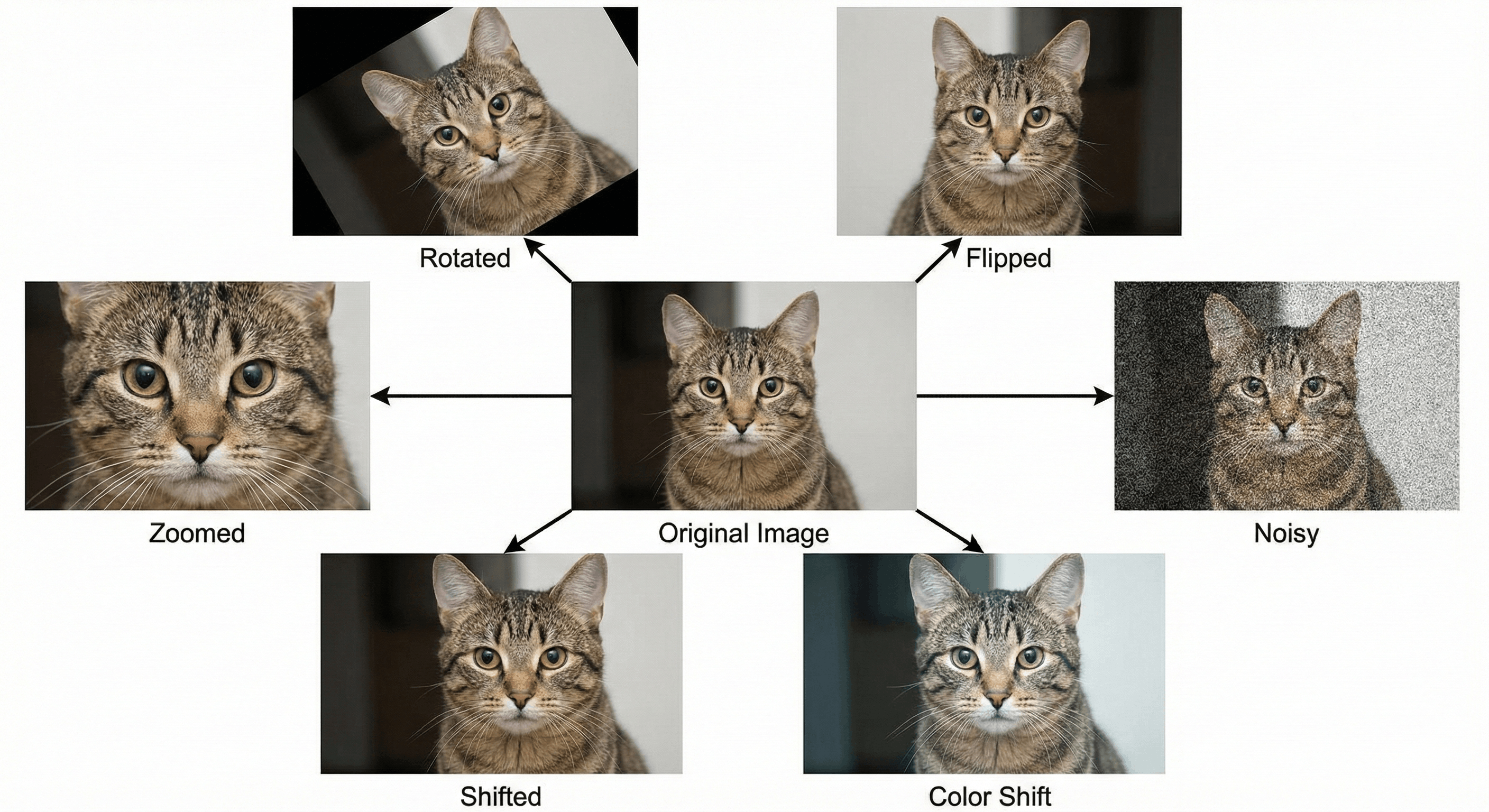 Figure: Original image and several augmented variants (rotate, flip, zoom).
And what if I told you that these new images would actually make your model smarter than the originals?
Figure: Original image and several augmented variants (rotate, flip, zoom).
And what if I told you that these new images would actually make your model smarter than the originals?
This is the power of Data Augmentation.
The Problem: Pixel Sensitivity
Computers are dumb. If you show a child a photo of a cat, they recognize it. If you rotate that photo 90 degrees, the child still says “Cat.”
If you train a Convolutional Neural Network (CNN) on upright cats, and then test it on a sideways cat, it will likely fail. To the computer, the matrix of pixels is completely different. It hasn’t learned the concept of a cat; it has learned the pixel arrangement of an upright cat.
The Solution: The Funhouse Mirror
To fix this, we intentionally distort our training data. Before we feed an image into the model, we randomly tweak it.
- Rotate it 15 degrees.
- Flip it horizontally (Mirror).
- Zoom in 10%.
- Shift it up or down.
- Add Noise (make it grainy).
By doing this, we achieve two massive wins:
- More Data: If you flip an image, you now have two unique training examples.
- Invariance: You force the model to learn that a cat is a cat regardless of whether it is facing left or right. You are teaching it Translation Invariance.
The Code: Keras ImageDataGenerator
You don’t need Photoshop for this. Deep Learning libraries do this “On the Fly” in memory while training.
from tensorflow.keras.preprocessing.image import ImageDataGenerator

# 1. Define the Augmentation Strategy
datagen = ImageDataGenerator(
    rotation_range=40,      # Rotate up to 40 degrees
    width_shift_range=0.2,  # Slide left/right
    height_shift_range=0.2, # Slide up/down
    shear_range=0.2,        # Slant the image
    zoom_range=0.2,         # Zoom in/out
    horizontal_flip=True,   # Mirror flip
    fill_mode='nearest'     # How to fill empty space
)

# 2. Fit it to your image
# (Assuming 'img' is a loaded image array)
# This generates infinite variations of that one image
i = 0
for batch in datagen.flow(x, batch_size=1):
    plt.imshow(image.array_to_img(batch[0]))
    i += 1
    if i > 4:
        break  # Stop after generating 5 variations
When NOT to use Augmentation
Be careful. You must respect the logic of your domain.
- Scenario A (Satellite Imagery): Flipping a map is fine. The ground looks the same.
- Scenario B (Digit Recognition): Flipping the number “6” vertically makes it a “9”. If you use vertical flip augmentation on the MNIST dataset, you will destroy your model.
11: The Wisdom of Crowds — Ensemble Methods
Imagine you are on the game show Who Wants to Be a Millionaire. You are stuck on a hard question. You have two lifelines left:
 Figure: Multiple weak learners (trees) voting to form a stronger prediction.
- Phone a Friend: Call one really smart person (e.g., a Professor).
- Ask the Audience: Poll 100 random people in the studio.
Statistically, Asking the Audience is almost always the safer bet. The Professor might have a specific bias or a gap in knowledge. But in a crowd of 100 people, the random errors cancel each other out, and the “signal” (the truth) emerges.
In Machine Learning, this concept is called Ensemble Learning. Instead of fighting to build one “Perfect Model” (which leads to Overfitting), we build 100 “Okay Models” and let them vote.
- The Two Main Strategies
There are two ways to build this “Committee of Models”: Bagging and Boosting.
1. Bagging (Bootstrap Aggregating)
The Example: Random Forest
- The Logic: “Parallel Independence.”
- The Process: You create 100 Decision Trees. You train each tree on a random subset of the data (this is the “Bootstrap” part).
- Tree 1 sees mostly data about mansions.
- Tree 2 sees mostly data about studio apartments.
- The Vote: When a new house comes in, all 100 trees make a prediction. We take the average.
- The Effect: This drastically reduces Variance (Overfitting). Even if one tree overfits to the mansions, the other 99 correct it.
2. Boosting
The Example: XGBoost / Gradient Boosting
- The Logic: “Sequential Improvement.”
- The Process: You train models one by one.
- Model 1: Tries to predict the data. It makes mistakes on the hard cases.
- Model 2: Looks specifically at the mistakes Model 1 made and tries to fix them.
- Model 3: Fixes the mistakes of Model 2.
- The Effect: This drastically reduces Bias (Underfitting). It turns a group of weak learners into a highly accurate specialist.
The Code: Random Forest in Scikit-Learn
Implementing a Random Forest is often easier than tuning a single Decision Tree because it works “out of the box.”
from sklearn.ensemble import RandomForestClassifier, GradientBoostingClassifier
from sklearn.model_selection import train_test_split
from sklearn.datasets import make_moons

# Generate complex, noisy data
X, y = make_moons(n_samples=500, noise=0.3, random_state=42)
X_train, X_test, y_train, y_test = train_test_split(X, y)

# 1. Random Forest (Bagging)
# "Build 100 trees, let them vote."
rf_model = RandomForestClassifier(n_estimators=100)
rf_model.fit(X_train, y_train)
print(f"Random Forest Acc: {rf_model.score(X_test, y_test):.4f}")

# 2. Gradient Boosting (Boosting)
# "Build 100 trees, each correcting the last."
gb_model = GradientBoostingClassifier(n_estimators=100)
gb_model.fit(X_train, y_train)
print(f"XGBoost Acc:       {gb_model.score(X_test, y_test):.4f}")
Why Ensemble Methods Rule the World
If you look at winning solutions on Kaggle (the competitive data science platform), 90% of them involve some form of Ensembling.
- It is harder to overfit (because the crowd averages out the noise).
- It is generally more robust to outliers.
The only downside? Interpretability. If your boss asks, “Why did the AI reject this loan?”, it’s easy to explain one Decision Tree (“It checked income > $50k”). It is very hard to explain a Random Forest (“Well, 400 trees voted Yes and 600 voted No…”).
12: The Metrics Trap — Why Accuracy is a Liar
Throughout this series, we have used the word “Accuracy” loosely. In the real world, Accuracy is often the worst metric you can use.
Let me prove it to you.
The Fraud Detection Paradox
Imagine you are building an AI to detect credit card fraud.
- The Reality: 99.9% of transactions are legit. Only 0.1% are fraud.
- The Lazy Model: I build a “Dumb Model” that simply prints
False(Not Fraud) for every single transaction. It doesn’t look at the data. It just says “No.”
The Score: This Dumb Model will be correct 99.9% of the time. Accuracy = 99.9%.
Your boss gives you a bonus. But the model is useless. It catches zero fraud. It failed at its only job.
This happens whenever you have Imbalanced Data (Cancer detection, Spam filters, Rare event prediction).
The Solution: Precision and Recall
To fix this, we need to break “Accuracy” down into four specific outcomes, known as the Confusion Matrix:
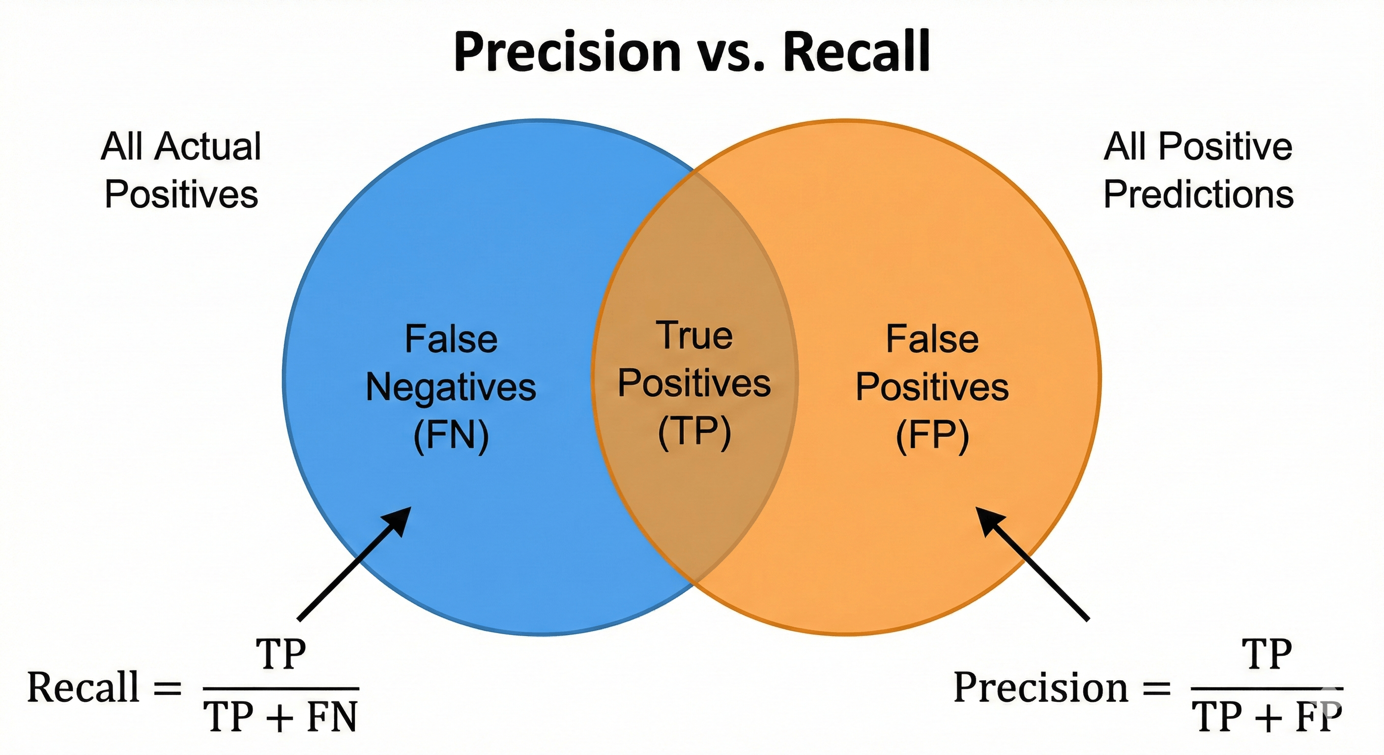 Figure: Venn diagram illustrating True Positives, False Positives, and False Negatives used to compute Precision and Recall.
- True Positive (TP): We predicted Fraud, and it was Fraud. (Good)
- True Negative (TN): We predicted Safe, and it was Safe. (Good)
- False Positive (FP): We predicted Fraud, but it was Safe. (False Alarm - Annoying)
- False Negative (FN): We predicted Safe, but it was Fraud. (Missed Detection - Dangerous)
From these, we derive the metrics that actually matter:
1. Precision (The Quality of “Yes”)
“Of all the transactions we flagged as Fraud, how many were actually Fraud?”
$$\text{Precision} = \frac{\text{TP}}{\text{TP} + \text{FP}}$$
- High Precision: I rarely cry wolf. If I say it’s fraud, it’s fraud.
- Low Precision: I flag everything as fraud, annoying legitimate customers.
2. Recall (The Quantity of “Yes”)
“Of all the actual Fraud in the world, how much did we catch?”
$$\text{Recall} = \frac{\text{TP}}{\text{TP} + \text{FN}}$$
- High Recall: I catch all the criminals (but maybe I arrest some innocent people too).
- Low Recall: I let criminals get away because I was too cautious.
3. The F1-Score (The Balance)
If you want a single number to optimize, use the F1-Score. It is the harmonic mean of Precision and Recall.
$$\text{F1} = 2 \times \frac{\text{Precision} \times \text{Recall}}{\text{Precision} + \text{Recall}}$$
If your Recall is 0 (like our Dumb Model above), your F1-Score is 0. This immediately exposes the fraud detector as useless, even though its Accuracy was 99.9%.
The Code: Classification Report
Scikit-learn gives you all of this in one line of code.
from sklearn.metrics import classification_report, confusion_matrix

# y_true = Actual labels (Ground Truth)
# y_pred = What your model guessed

print(confusion_matrix(y_true, y_pred))
# Output:
# [[900  10]  <-- 900 True Negatives, 10 False Positives
#  [ 80  10]] <-- 80 False Negatives (Missed!), 10 True Positives

print(classification_report(y_true, y_pred))
# Output:
#               precision    recall  f1-score   support
#           0       0.92      0.99      0.95       910
#           1       0.50      0.11      0.18        90
#    accuracy                           0.91      1000
Notice the Class 1 (Fraud) scores.
- Precision: 0.50 (Only 50% of our flags were right).
- Recall: 0.11 (We missed 89% of the fraud!).
- Accuracy: 0.91 (Looks great, but hides the truth).
13: The Tuning Game — Grid Search vs. Random Search
Every Machine Learning model has two types of parameters:
- Parameters (Weights): The numbers the model learns automatically during training (e.g., the slope of the line).
- Hyperparameters (Settings): The numbers you must choose before training starts.
Think of it like a radio. The music is the data. The volume and bass knobs are the Hyperparameters.
- How deep should the Decision Tree be? (
max_depth) - How many neighbors should we count? (
n_neighbors) - How aggressively should we regularize? (
alpha)
If you choose the wrong settings, even the best algorithm will fail. But tuning them manually is boring and slow.
Strategy 1: Grid Search (The Brute Force)
The most obvious way to find the best settings is to try everything.
Imagine you have two knobs:
max_depth: [10, 20, 30]n_estimators: [50, 100, 200]
Grid Search creates a spreadsheet of every possible combination ($3 \times 3 = 9$ combinations) and trains a model for each one.
- Pros: Guaranteed to find the best combo within your grid.
- Cons: Extremely slow. If you add a third knob with 5 options, your training time explodes ($3 \times 3 \times 5 = 45$ models). This is the Curse of Dimensionality again.
Strategy 2: Random Search (The Smart Gamble)
Random Search does exactly what it sounds like. You define a range for each knob, and the computer randomly picks combinations to try.
- The Logic: In most datasets, only one or two hyperparameters actually matter (e.g.,
Learning Rateis crucial, butBatch Sizemight not matter much). - Grid Search wastes time checking every variation of the unimportant parameter.
- Random Search explores the “important” parameter much more thoroughly because it isn’t stuck repeating the same values on a fixed grid.
The Verdict: Research shows that Random Search is almost always more efficient than Grid Search for high-dimensional problems.
The Code: Automating Optimization
Scikit-learn makes this trivial. We don’t write loops; we use GridSearchCV.
from sklearn.model_selection import GridSearchCV, RandomizedSearchCV
from sklearn.ensemble import RandomForestClassifier

# 1. Define the Parameter Grid
param_grid = {
    'n_estimators': [50, 100, 200],
    'max_depth': [None, 10, 20, 30],
    'min_samples_split': [2, 5, 10]
}

# 2. Initialize the Model
rf = RandomForestClassifier()

# 3. Setup Grid Search
# cv=5 means "Use 5-Fold Cross-Validation for every single combo"
grid_search = GridSearchCV(
    estimator=rf,
    param_grid=param_grid,
    cv=5,
    scoring='accuracy',  # Or 'f1'
    n_jobs=-1            # Use all CPU cores
)

# 4. Run the Search (This takes time!)
grid_search.fit(X_train, y_train)

# 5. Get the Winner
print(f"Best Params: {grid_search.best_params_}")
print(f"Best Score:  {grid_search.best_score_}")

# The best model is automatically saved inside 'grid_search'
best_model = grid_search.best_estimator_
Beyond Random: Bayesian Optimization
If you want to be really fancy, you can use Bayesian Optimization (libraries like Optuna or Hyperopt).
Grid and Random search are “stateless”—they don’t learn from their past attempts. Bayesian Optimization is smart. If it tries alpha=0.1 and gets a bad score, it learns to avoid that region of numbers in the future. It surfs the error surface to find the minimum.
14: The Human in the Loop — Error Analysis
You have tuned your hyperparameters. You have used Ensembles. You have used Dropout. Your accuracy is stuck at 95%. You need 96%.
You can spend weeks trying new algorithms, or you can spend 30 minutes doing Error Analysis.
Error Analysis is the process of manually inspecting the specific examples your model is getting wrong. It is tedious, unglamorous, and absolutely necessary.
The “Gallery of Rogues”
Don’t just stare at the 0.95 number. You need to see the 0.05.
If you are building an Image Classifier (Cat vs. Dog), write a script that displays the specific images where Prediction != Label.
When you look at these 100 failed images, you will usually find they fall into three buckets. Each bucket requires a different fix.
Bucket 1: The “Impossible” Data (Data Quality)
- What you see: The image is a black blur. Or it’s a photo of a dog taken from 5 miles away. Or the image is corrupted.
- The Reality: Even a human couldn’t classify this.
- The Fix: Stop blaming the model. You need to fix your data collection pipeline. Improve the camera, or remove these “garbage” images from the Test Set so they don’t skew your metrics.
Bucket 2: The “Wrong Label” (Label Noise)
- What you see: The image is clearly a Cat. The model predicted “Cat.” But the Ground Truth label says “Dog.”
- The Reality: The human who labeled the training data made a mistake.
- The Fix: Your model was actually right! You need to clean up your dataset labels. In large datasets like ImageNet, it is estimated that 3-5% of labels are actually wrong.
Bucket 3: The “Systematic Error” (Model Blindness)
- What you see: The model consistently fails on “White Dogs in the Snow.”
- The Reality: The model has learned that “White Background = Empty.” It hasn’t learned to distinguish white fur from white snow.
- The Fix: This is a goldmine. Now you know exactly what data to collect. Go find 500 more photos of white dogs in snow and add them to the training set.
The Benchmark: Human-Level Performance
To know if your model is doing “well,” you need a baseline. The best baseline is Human-Level Performance (HLP).
Andrew Ng, the godfather of AI education, teaches a specific framework:
- Human Accuracy: 99% (Experts make mistakes 1% of the time).
- Training Accuracy: 99%.
- Validation Accuracy: 96%.
Diagnosis: You have a Variance Problem (Overfitting). The gap between Train and Val is huge.
vs.
- Human Accuracy: 99%.
- Training Accuracy: 96%.
- Validation Accuracy: 95.5%.
Diagnosis: You have a Bias Problem (Avoidable Bias). The gap between Human and Training is huge. Your model isn’t even learning the basics compared to a human. You need a bigger network.
The Code: Finding the Failures
Here is a snippet to isolate the failures in your validation set.
import numpy as np

# 1. Get Predictions
preds = model.predict(X_val)
pred_labels = np.argmax(preds, axis=1)
true_labels = np.argmax(y_val, axis=1)

# 2. Find Indices where they don't match
error_indices = np.where(pred_labels != true_labels)[0]

# 3. Print the first 5 failures
print(f"Total Errors: {len(error_indices)}")

for i in error_indices[:5]:
    print(f"Index: {i}")
    print(f"Predicted: {pred_labels[i]}, Actual: {true_labels[i]}")
    # (Optional) Plot the image here using matplotlib
    # plt.imshow(X_val[i])
15: The Ultimate Checklist — From Zero to Production
We have traveled a long road. We started by realizing that 100% Accuracy is a Lie. We walked through the geometry of Overfitting, the math of Regularization, and the art of Error Analysis.
Now, we bring it all together.
When you start your next project, do not guess. Do not hope for the best. Follow this protocol.
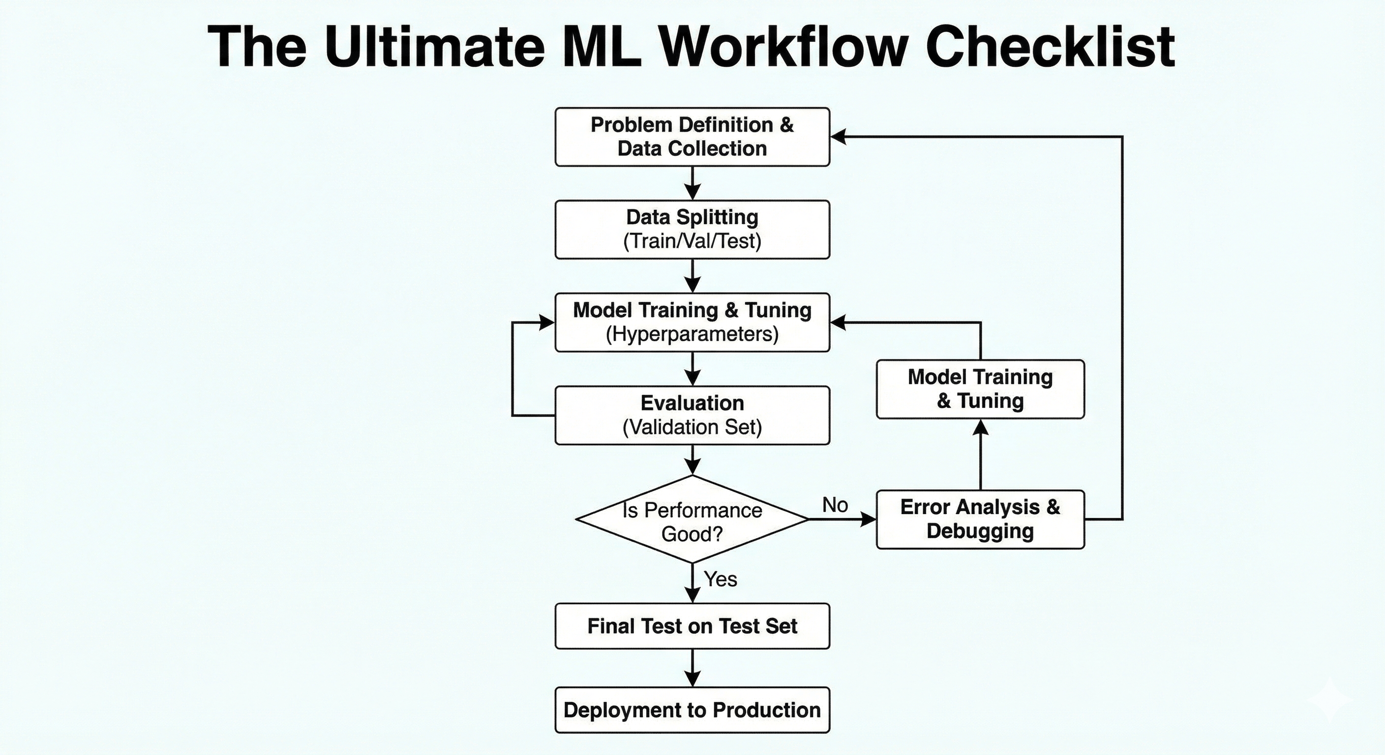 Figure: End-to-end flowchart summarizing data collection, training, evaluation, and deployment.
Phase 1: The Setup (Preventing Disaster)
- [ ] The Split: Did I use a Test Set that the model has never seen?
- Rule: Never touch the Test Set until the very end.
- [ ] The Leak: Is there data in my training set that reveals the future?
- Check: If predicting “Loan Default,” remove columns like “Late Payment Fee” which only appear after the default happens.
- [ ] The Validation: Am I using K-Fold Cross-Validation?
- Rule: Don’t rely on a single lucky split. Use
cross_val_score.
- Rule: Don’t rely on a single lucky split. Use
Phase 2: The Diagnosis (The Bias-Variance Tradeoff)
- [ ] Plot Learning Curves:
- Flat & High Error? -> Underfitting (High Bias).
- Diverging Lines (Gap)? -> Overfitting (High Variance).
- [ ] Compare to Human Baseline:
- If Human Accuracy is 99% and Training Accuracy is 90%, you have a Bias problem.
- If Training Accuracy is 99% and Validation Accuracy is 90%, you have a Variance problem.
Phase 3: The Treatment (The Toolkit)
If Underfitting (Too Dumb):
- [ ] Increase Complexity: Add more layers (Deep Learning) or increase Tree Depth.
- [ ] Feature Engineering: Create new columns (e.g.,
Price / SqFt). - [ ] Reduce Regularization: Decrease
alpha(Lasso/Ridge) ordropoutrate. - [ ] Train Longer: Increase epochs.
If Overfitting (Too Smart):
- [ ] Get More Data: The ultimate cure.
- [ ] Data Augmentation: Flip, rotate, and zoom your images.
- [ ] Early Stopping: Stop training when Validation Loss rises.
- [ ] Regularization: Increase L1/L2 penalties.
- [ ] Dropout: Randomly disable neurons.
- [ ] Simplify Model: Reduce layers or use Dimensionality Reduction (PCA).
- [ ] Ensembling: Use Random Forest or Bagging to average out the noise.
Phase 4: The Evaluation ( The Truth)
- [ ] Check Class Balance: Is my data 50/50 or 99/1?
- [ ] Choose the Right Metric:
- Balanced? -> Accuracy.
- Cost of False Negative is high (Cancer)? -> Recall.
- Cost of False Positive is high (Spam)? -> Precision.
- Need a balance? -> F1-Score.
Phase 5: The Refinement (The Human Touch)
- [ ] Hyperparameter Tuning: Did I run a
RandomizedSearchCVto find the best settings? - [ ] Error Analysis: Did I look at the 50 images the model got wrong?
- Action: Fix the “White Dog in Snow” problem by collecting targeted data.
The Final Philosophy
Machine Learning is not magic. It is engineering.
It is the art of balancing Memory (Training Data) with Understanding (Generalization). It is the discipline of accepting that Perfect is the enemy of Good.
If you build a model that generalizes well, robustly handles new data, and solves the business problem—congratulations. You are no longer just coding. You are doing Data Science.
